📌 이미지를 이용하지 않고 css를 이용하여 버튼 이미지 효과를 낼 수 있습니다.
|
※ 기본 구조
<button>버튼 텍스트</button>※ 주요 속성:
- type: 버튼의 종류를 지정합니다 (submit, button, reset 등).
- value: 버튼에 대한 추가적인 값을 제공합니다 (form 데이터 전송 시 사용).
- disabled: 버튼을 비활성화합니다.
※ 예시:
<!DOCTYPE html>
<html lang="ko">
<head>
<meta charset="UTF-8">
<title>Document</title>
</head>
<body>
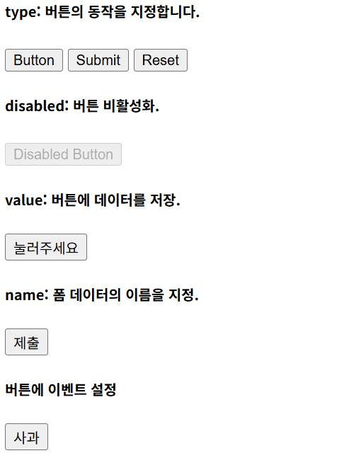
<h5> type: 버튼의 동작을 지정합니다. </h5>
<button type="button">Button</button>
<button type="submit">Submit</button>
<button type="reset">Reset</button>
<br>
<h5> disabled: 버튼 비활성화.</h5>
<button disabled>Disabled Button</button>
<br>
<h5> value: 버튼에 데이터를 저장.</h5>
<button type="button" value="button1">눌러주세요</button>
<br>
<h5> name: 폼 데이터의 이름을 지정.</h5>
<button type="submit" name="submitButton">제출</button>
<h5> 버튼에 이벤트 설정 </h5>
<button type="button" onclick="alert('사과');">사과</button>
</body>
</html> ✅ 결과
※ CSS 로 버튼 스타일링하기
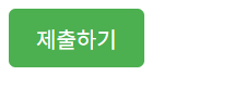
★ 기본 스타일링
배경색, 글꼴 크기, 테두리를 꾸민 예제입니다
<!DOCTYPE html>
<html lang="ko">
<head>
  <meta charset="UTF-8">
  <title>Document</title>
  <style>
    /* 기본 버튼 스타일 */
    .basic-button {
      background-color: #4CAF50;
      /* 버튼 배경색: 초록색 */
      color: white;
      /* 버튼 텍스트 색상: 흰색 */
      font-size: 16px;
      /* 텍스트 크기: 16px */
      padding: 10px 20px;
      /* 버튼 안쪽 여백: 위아래 10px, 양옆 20px */
      border: none;
      /* 테두리 제거 */
      border-radius: 5px;
      /* 모서리를 둥글게 처리 (반지름 5px) */
      cursor: pointer;
      /* 마우스를 올릴 때 포인터 커서 표시 */
    }

    /* 버튼에 마우스를 올렸을 때의 스타일 */
    .basic-button:hover {
      background-color: #45a049;
      /* 버튼 배경색: 조금 더 짙은 초록색 */
    }
  </style>
</head>
<body>
<button class="basic-button">제출하기</button>
</body>
</html>
✅ 결과
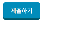
★ 그림자와 애니메이션 추가
<!DOCTYPE html>
<html lang="ko">
<head>
  <meta charset="UTF-8">
  <title>Document</title>
  <style>
    /* 그림자 버튼 스타일 */
    .shadow-button {
      background-color: #008CBA;
      /* 버튼 배경색: 파란색 */
      color: white;
      /* 버튼 텍스트 색상: 흰색 */
      font-size: 16px;
      /* 텍스트 크기: 16px */
      padding: 10px 20px;
      /* 버튼 안쪽 여백: 위아래 10px, 양옆 20px */
      border: none;
      /* 테두리 제거 */
      border-radius: 5px;
      /* 모서리를 둥글게 처리 (반지름 5px) */
      cursor: pointer;
      /* 마우스를 올릴 때 포인터 커서 표시 */
      box-shadow: 0 4px #005f73;
      /* 버튼의 그림자: 아래쪽으로 4px, 색상은 어두운 파란색 */
    }

    /* 버튼에 마우스를 올렸을 때의 스타일 */
    .shadow-button:hover {
      background-color: #005f73;
      /* 버튼 배경색: 어두운 파란색 */
      box-shadow: 0 6px #003f50;
      /* 그림자 크기 증가: 아래쪽으로 6px, 더 어두운 파란색 */
      transform: translateY(-2px);
      /* 버튼이 약간 위로 올라가 보이게 이동 */
    }
  </style>

</head>
<body>
<button class="shadow-button">제출하기</button>
</body>
</html>
✅ 결과
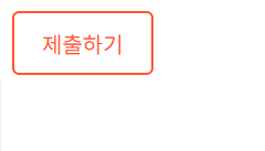
★ 글자 애니메이션 효과
<!DOCTYPE html>
<html lang="ko">
<head>
  <meta charset="UTF-8">
  <title>Document</title>
  <style>
    /* 애니메이션 버튼 스타일 */
    .animated-button {
      background-color: transparent; /* 버튼 배경색: 투명 */
      color: #FF5733; /* 버튼 텍스트 색상: 주황색 */
      font-size: 16px; /* 텍스트 크기: 16px */
      padding: 10px 20px; /* 버튼 안쪽 여백: 위아래 10px, 양옆 20px */
      border: 2px solid #FF5733; /* 테두리: 2px, 주황색 */
      border-radius: 5px; /* 모서리를 둥글게 처리 (반지름 5px) */
      cursor: pointer; /* 마우스를 올릴 때 포인터 커서 표시 */
      position: relative; /* 자식 요소를 기준으로 배치할 수 있게 상대 위치 지정 */
      overflow: hidden; /* 버튼 영역 밖으로 나간 요소는 숨김 처리 */
    }

    /* 버튼 안에 배경 애니메이션 효과를 위한 가상 요소 */
    .animated-button::before {
      content: ''; /* 가상 요소 내용 없음 */
      position: absolute; /* 버튼 안에서 절대 위치 지정 */
      top: 0; /* 상단 0 */
      left: -100%; /* 초기 위치: 버튼 왼쪽 밖 */
      width: 100%; /* 가로 크기: 버튼 전체 */
      height: 100%; /* 세로 크기: 버튼 전체 */
      background: #FF5733; /* 가상 요소 배경색: 주황색 */
      transition: all 0.4s; /* 애니메이션 시간: 0.4초 */
      z-index: 0; /* 배경 요소가 텍스트 아래로 가도록 설정 */
    }

    /* 마우스를 올렸을 때 애니메이션 */
    .animated-button:hover::before {
      left: 0; /* 가상 요소가 버튼 내부로 이동 */
    }

    /* 버튼 텍스트 스타일 */
    .animated-button span {
      position: relative; /* 가상 요소 위에 텍스트를 표시하도록 상대 위치 지정 */
      z-index: 1; /* 텍스트가 가상 요소 위에 나타나도록 설정 */
      color: white; /* 텍스트 색상: 흰색 */
    }
  </style>

</head>
<body>
<button class="animated-button">제출하기</button>
</body>
</html>
✅ 결과
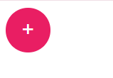
★ 라운드 효과
<!DOCTYPE html>
<html lang="ko">
<head>
  <meta charset="UTF-8">
  <title>Document</title>
  <style>
    /* 라운드 버튼 스타일 */
    .circle-button {
      width: 50px; /* 버튼의 가로 크기: 50px */
      height: 50px; /* 버튼의 세로 크기: 50px */
      background-color: #e91e63; /* 버튼 배경색: 분홍색 (#e91e63) */
      color: white; /* 버튼 텍스트 색상: 흰색 */
      border: none; /* 테두리 제거 */
      border-radius: 50%; /* 버튼을 원형으로 만듦 (반지름: 50%) */
      font-size: 24px; /* 텍스트 크기: 24px */
      cursor: pointer; /* 마우스를 올릴 때 포인터 커서 표시 */
      display: flex; /* 버튼 안의 내용을 중앙 정렬하기 위해 flexbox 사용 */
      justify-content: center; /* 수평 가운데 정렬 */
      align-items: center; /* 수직 가운데 정렬 */
    }

    /* 마우스를 올렸을 때 버튼 스타일 */
    .circle-button:hover {
      background-color: #d81b60; /* 버튼 배경색: 조금 더 진한 분홍색 (#d81b60) */
    }
  </style>

</head>
<body>
<button class="circle-button">+</button>
</body>
</html>
✅ 결과
★ icon(아이콘)를 이용하여 버튼만들기
<!DOCTYPE html>
<html lang="ko">
<head>
  <meta charset="UTF-8">
  <title>Document</title>
  <link rel="stylesheet" href="https://stackpath.bootstrapcdn.com/font-awesome/4.7.0/css/font-awesome.min.css">
  <style>
    /* 라운드 버튼 스타일 */
    .icon-button::before {
      content:"\f0c9";   /* f0c9은 fontawesome에서 bars의 유니코드 */
      font-family: fontAwesome; /* fontAwesome는 fontawesome에서 사용하는 폰트 */
    }

    .icon-button {
      width: 50px; /* 버튼의 가로 크기: 50px */
      height: 50px; /* 버튼의 세로 크기: 50px */
      background-color: #e91e63; /* 버튼 배경색: 분홍색 (#e91e63) */
      color: white; /* 버튼 텍스트 색상: 흰색 */
      border: none; /* 테두리 제거 */
      border-radius: 50%; /* 버튼을 원형으로 만듦 (반지름: 50%) */
      font-size: 24px; /* 텍스트 크기: 24px */
      cursor: pointer; /* 마우스를 올릴 때 포인터 커서 표시 */
      display: flex; /* 버튼 안의 내용을 중앙 정렬하기 위해 flexbox 사용 */
      justify-content: center; /* 수평 가운데 정렬 */
      align-items: center; /* 수직 가운데 정렬 */
    }

    /* 마우스를 올렸을 때 버튼 스타일 */
    .icon-button:hover {
      background-color: #d81b60; /* 버튼 배경색: 조금 더 진한 분홍색 (#d81b60) */
    }
  </style>

</head>
<body>
<button class="icon-button"></button>
</body>
</html>
✅ 결과

※icon(아이콘) 를 이용하여 버튼만들기를 참고하세요
🖥️ Font Awesome 이용하기
[HTML+CSS+JavaScript] icon(아이콘)이 필요할 때 - Font Awesome 사용하기
[HTML+CSS+JavaScript] icon(아이콘)이 필요할 때 - Font Awesome 사용하기 Font Awesome은 웹에서 다양한 아이콘을 손쉽게 활용할 수 있는 CSS 라이브러리입니다. Font Awesome 6버전까지 출시가 되었어도 아
happyldh.tistory.com
🖥️ XE Icon 이용하기
[HTML+CSS] icon(아이콘)이 필요할 때 - XE Icon사용하기
XE Icon은 웹에서 다양한 아이콘을 손쉽게 활용할 수 있는 CSS 라이브러리입니다. 웹사이트 제작에 최적화된 벡터 그래픽 아이콘 툴킷으로, 다양한 아이콘을 손쉽게 웹페이지에 적용할
happyldh.tistory.com
'프로그래밍 > html+css+js' 카테고리의 다른 글
| [css] display 속성 정리 block / inline / inline-block (0) | 2025.03.20 |
|---|---|
| [html/css] text-shadow 텍스트에 그림자 넣기 (효과 주기) (0) | 2025.03.13 |
| [HTML+CSS+JavaScript] CSS font-face 사용법 (0) | 2025.01.19 |
| [HTML+CSS+JavaScript] 눈누 웹 폰트 사용하기 (1) | 2025.01.19 |
| [HTML+CSS+JavaScript] CSS font-family 사용법 (1) | 2025.01.17 |